For an online subscription business, there’s arguably no page on your site more important than the subscription landing page itself—the one that lays out all of your brand’s subscription benefits, answers prospects’ most pressing questions, and guides them to sign up.
Your brand needs compelling marketing to convert; if customers don’t understand what separates your brand from the competition, you’re unlikely to stand out. An effective, persuasive subscription page will make sure your acquisition spending is used well, which is extra important when acquisition is getting pricier all the time.
Every successful subscription landing page has a few things in common. This blog will walk through some of the most effective tactics to employ in your brand’s own subscription page, using the one crafted by the folks over at Verve Coffee as an example.
Key takeaways
- Tailor your subscription landing page to your audience by understanding their personas and aligning your messaging with their needs and preferences.
- Clearly state your value proposition through concise and compelling content to guide users towards understanding the benefits of your subscription.
- Continuously test and iterate on your landing page's elements, such as headlines and CTAs, using data to optimize for maximum conversion and effectiveness.
1. Tailor your landing page to your audience
Every product has a target audience, or a specific demographic or type of person it’s intended to resonate with. It’s crucial that every part of your brand work in sync to appeal to the same customer—if a premium product aimed at the luxury market has a subscription landing page that instead emphasizes value and convenience, that audience is going to receive mixed messages and be unsure if the product is truly for them.
What are audience personas?
Audience personas are fictional personalities made to represent segments of your audience, helping you understand and appeal to each type of customer. They’re a common fixture around the industry, and many brands even have multiple personas: one to represent customers who browse broadly, one for customers who hunt for specific items, one for customers focused on exceptional value, etc.
How to get started with audience personas
To create your personas, combine what you already know about your audience with information gleaned from questionnaires, databases, and other sources—anything that can tell you about your target demographics is fair game.
Start dividing those demographics into segments based on the factors that might draw them to your brand and the pain points that they may try to solve. Find where those intersect with your brand’s value and products and you’ll be well on your way to understanding your audience.
2. State your value with crisp content & copy
With audience personas in hand, it’s time to start plotting out the content for your subscription landing page.
Understand your value proposition
Anchor around a clear value proposition, or the benefits that a customer gains by choosing your brand. Your value proposition doesn’t need to be explicitly written in one sentence on your landing page—it can be communicated in parts, and even through images—but every part of a successful subscription landing page will reinforce it.

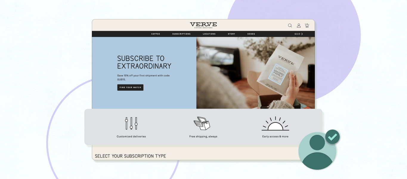
Look at Verve’s landing page for example. While the headline “Subscribe to extraordinary” isn’t quite an explicit value proposition, when it’s paired with images of their elegant packaging, it’s clear that Verve’s value proposition involves both subscriptions and exceptional coffee for coffee enthusiasts, as opposed to something like an extra-convenient coffee prep method for customers trying to shave a few minutes off their morning routines. That’s an important distinction to customers, and one that’s wise to make early on.
The section underneath illuminates some more perks of a Verve subscription: custom deliveries for flexibility, quick delivery, and early access to new products. With just a few words and icons, their landing page deftly touches on exactly why someone might subscribe to their coffee; in other words, their value proposition.
Open with a captivating headline
No pressure, but the headline on your subscription landing page is one of the most important pieces of text on your website. It’s a small space that can make or break a sale. Use that real estate wisely.
Return to your value proposition. What’s the main benefit your brand offers? An exceptional new experience? Incredible bang for your buck? Now try to express that idea in a few words. Don’t worry about writing anything fancy—the most important thing is that your headline is clear, so customers understand exactly what they stand to gain from you.
Again, Verve’s “subscribe to extraordinary” does a lot with just a few words. Most of it is just a verb and an adjective. But those words were carefully selected to represent two core components of the brand, making for an effective bit of communication.
Close with a compelling call to action (CTA)
Good CTAs work in tandem with headlines, bookending subscription landing pages with snappy copy and enticing offers. They prompt users to take a particular action, in this case subscribing to your services.
Since the CTA copy needs to fit inside a button, short is good and direct is better. Simple options like “Sign up,” “Learn more,” and “Register now” are popular and foolproof. But this can also be an opportunity to say something more about your brand or subscription offering. Verve’s “Find your match” specifically does not prompt users to sign up; instead, it promises find them exactly the right product, offering help rather than making demands.
Use energetic language throughout
Effective copy is brief, direct, and active. Don’t clog your landing page with excessive detail about your brand story (there’s room for that elsewhere on your site); make your case simply, laying out your products’ benefits to help customers make decisions.
When possible, lead with strong action verbs: “Subscribe to extraordinary.” “Unlock exclusive new products.” Verbs are powerful and persuasive—use them at will.
Highlight benefits over features
Features are narrow; they miss the forest for the trees. Your brand may sell a suitcase made with features like ultra-durable titanium zippers, and those are great, but your customers are more interested in the benefits that those features ultimately deliver—like the peace of mind derived from a rugged, thoughtfully-designed piece of luggage that they can trust to handle a whirlwind trip to Prague.
3. Guide users with thoughtful design
By now your subscription landing page clearly lays out your brand’s value proposition and core benefits (not features!). But even the best content needs to be packaged well to be effective.
That’s where your landing page design comes in. Visual elements deserve just as much attention as verbal ones.
Ease navigation with visual hierarchy
Visual hierarchy can make subscription landing pages so easy to navigate that users barely register that they’re doing it. While there are lots of principles to consider in designing the landing page, the core of the idea is pretty simple. First, think of what’s most important for customers to see. Next, make those things really easy to see.
That means emphasizing elements like the headline and CTA—whether that’s with larger type, vibrant colors, or a combination of factors— while letting supporting copy recede into the background more so it doesn’t compete for attention.
Capture attention with vibrant imagery
Text on a page won’t get the job done on its own. Your landing page is the perfect place to showcase your products—show them in use, in interesting environments, from new angles customers wouldn’t expect.
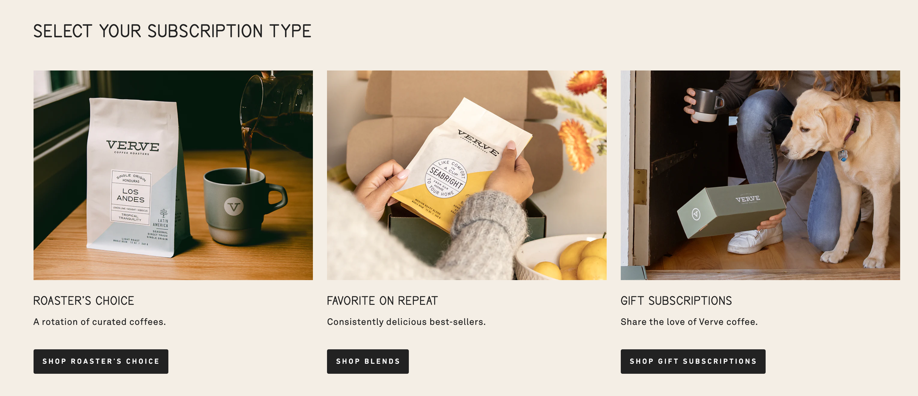
Or go even deeper than that! Explore different facets of your products’ origins or the process that creates them. Verve’s landing page includes shots of live coffee plants, connecting customers to the farms their beans come from and the people who grow them—it lends an entire new dimension to what could otherwise just be a transaction.

Optimize for mobile responsiveness
Phones aren’t going anywhere—the majority of ecommerce sales already come from mobile devices, and that rate is only increasing. Design your site to accommodate any range of screen sizes to make sure you don’t exclude any potential customers.
4. Take the anxiety out of subscriptions
Simplify the process
The user experience doesn’t end at your site’s UI. Subscriptions themselves can be intimidating to customers. They’re a fixed, recurring cost with a lot of unknowns at first—how do I know which products are right for me? How do I know how often to order? What if I don’t get it right?
There are lots of ways to ease those concerns further down the funnel, like offering flexible delivery cadences and easy product swaps. But you can address them earlier too, right on your subscription landing page, with tools like Verve’s coffee subscription slider.

This clever little device saves prospective subscribers from breaking out a calculator and unit conversion charts (or bailing altogether) by simply asking how many cups of coffee they’ll need each day and calculating the right subscription for them.
And that’s not all—to help customers navigate their selection of specialty coffees, Verve even offers a subscription quiz that guides users to the options they’re most likely to love.
Think of the most common pain points customers encounter with your products. There’s likely a similar way you can remove them from the equation altogether.
Incorporate social proof
Lots of products come with glitzy marketing and dazzling copy that makes everything sound good while making it impossible to tell what’s actually credible. Customers are rightfully wary of new products and look for evidence of their quality.
You can do some of that work for them and cut through the noise. The simplest way is to highlight your products’ user reviews—seek testimonials from satisfied customers that you can place front-and-center on your subscription landing page and alleviate future shoppers’ concerns.
And if your products have been reviewed, tested, or approved by trusted third parties, even better! That’s an extra layer of validation on top of user trust. Don’t be shy about broadcasting any certifications or professional reviews your products have received.
And if your products are enterprise-ready, you can go even deeper by publishing case studies that highlight the specific ways they’ve benefited clients. Case studies are an exceptional tool—they provide room for you to explore every detail of your products, helping customers learn about them inside and out.
Answer FAQs
If new or existing subscribers frequently ask about the same aspects of your products or subscription services, that’s a sign of an opportunity to address concerns early on in the process. Consider doing so with something as simple as an FAQ section on your subscription landing page.
A catch-all segment like this might not feel as elegant as copy that flows effortlessly from one selling point to the next, but that’s okay! Sometimes the simplest answer is best, and many customers will even specifically track down an FAQ section. Meet them where they are.

5. Test and iterate
Congratulations! You’ve built a fully functional subscription landing page with enticing copy, snappy design, and oodles of glowing product reviews. You’re done.
Just kidding. Time to test your page’s performance and make sure it’s as good as it can be.
Why test your landing page?
Performance testing is crucial to optimizing your page—it helps you identify areas of it that you can improve, ultimately raising conversion, stretching your acquisition spending further, and boosting sales.
What to test
Virtually every element of your landing page can be optimized somehow, but it’s best to focus on the elements that most directly impact conversion: the headline, the CTA, and other conspicuous bits of copy or design in prominent areas of the page.
For each of those elements, there are infinite possible approaches to take. For the CTA button, for example, you could A/B test:
- Placement
- Color
- Copy
- Shape
And for the headline, you could explore versions that emphasize different aspects of your brand, ones that vary in tone, ones that are longer or shorter.
That’s a lot. To keep things simple, try narrowing down the variants to just a couple that are distinct from each other and may perform significantly differently. Then test just a very small number of options against each other (ideally two) to end up with the cleanest possible view of the winner.
Use data to guide constant improvement
Though some copy and design decisions will be made primarily on the basis of how well they represent your brand, these have a very clear function: conversion. So no matter how good they look in a vacuum, you need to know they’re doing their job effectively, which means you need to collect data on them.
Conversion rate optimization is a constant process, not a one-time one. You need to keep up with customers and the market—tastes evolve, design preferences evolve, your brand will evolve. Stay vigilant for elements of your landing page that could be ripe for a refresh so you can remain confident that the page is performing at its best.
Thoughtful subscription landing pages drive conversion
Let’s recap: the subscription landing page is one of the most important elements of your online store as one of the primary drivers of conversion. You can optimize its performance by focusing on a few high-level areas:
- Copy and content. Your landing page should be tailored specifically to your target audience, which you can represent with audience personas. It should present a clear value proposition that addresses your audience’s needs and wants. The copy itself should be clear and direct, helping users understand exactly how they’ll benefit from your products with no added distractions.
- Design and visual appeal. Design supports content; your landing page needs a strong visual hierarchy so users can identify the most important elements on the page and learn what they need to. It should also feature eye-catching imagery where possible, to add visual appeal and showcase your products in use.
- Testing and iteration. Testing variants of important site elements will tell you whether they’re performing at their best and driving conversion as intended. Iteration is a constant process; stay on the lookout for elements that could benefit from another angle.The best subscription landing pages all apply each of these elements carefully.
Sources
[1] How to create audience personas – a beginner’s guide (Tiller Digital)
[2] Value Proposition Definition (Glossary)
[3] 7 Visual Hierarchy Principles for Every Marketer (HubSpot)
[4] Global Mobile E-Commerce Worth $2.2 Trillion in 2023 (Statista)
[5] The Complete Guide to A/B Testing: Expert Tips From Google, HubSpot, and More (Shopify)
[6] Verve Coffee (Verve)
