
Thanks to Paola Ramirez Gutierrez and Robb Green for providing this blog post.
Changing style settings using the Shopify theme editor can feel daunting if you’re not a designer. So, we made it as simple as possible to craft an appealing and brand-aligned customer portal, just by tweaking a few key elements.
In this blog post, we’ll take you through how to personalize your customer portal to stay true to your brand and ensure a cohesive customer experience for your shoppers.
Before you start
In Recharge, navigate to Customer Portal in the Storefront section, and set your portal to “Embedded in platform storefront.” This means your portal will inherit your main site’s header, footer, and basic styling, so you’re off to a great start.
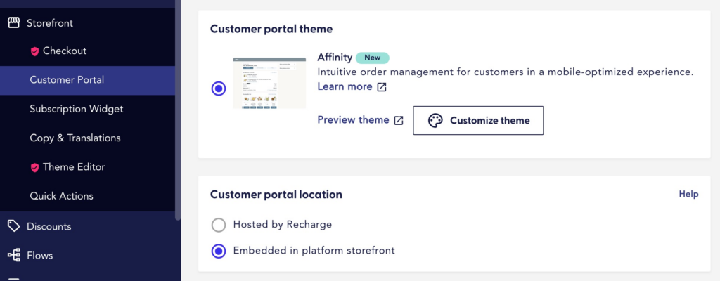
Create a test account for your store, so you can safely preview your portal without affecting any real users. Then, click on “customize theme” to access the theme editor and begin the customization process.
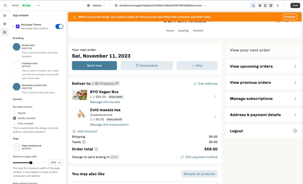
Step 1: Colors
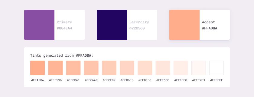
Start by getting the hex code for your brand’s signature color. This will usually be the color used for buttons and other prominent elements throughout your site.
If you’re not sure how to get the hex code, follow this guide to copy it directly from your browser.
Now that you know your signature color hex code, use it for both the primary and secondary brand color in the theme editor. Leave the contrast color untouched, and you’ll already have a portal that looks much more like your brand.

Tip: If your brand color is really light, using it for links and icons might create accessibility issues. A good alternative is to use a darker shade of your brand color instead. You can either do this by eye, or by generating a shade on this website. If you want to check that your color works for people with visual impairments, use this contrast checker—just set the background color to #FFFFFF for white, and paste your hex code as the foreground color.
Step 2: Corner shape
How rounded your corners are can have a big impact on how your brand feels.
Have a look at your main site, and notice what shape the corners are on images, buttons, and other elements. In the theme editor, select square, slightly rounded, or very rounded corners to match your portal to your site.
Step 3: Background contrast
Set a background color to help create a good visual balance between the page background and the content cards. Very light, muted colors and grays tend to work well—you’ll usually be better off with a subtle distinction between the background and the cards, not a dramatic contrast.
Use an existing light background from your main site to maintain a coherent visual experience. If you don’t have a suitable background color, try generating lighter tints of a brand color and using those.
Step 4: Optimize image sizes
Because Affinity pulls in product images from Shopify, it’s important to ensure they look as good as possible. In the theme editor, set the image size to square, portrait, or landscape, depending on what works best for your images.
What about fonts?
Because you chose to embed your portal in the platform storefront, Affinity automatically inherits the fonts from your store—so you don’t need to do anything. One less thing to worry about!
Wrapping up
Congratulations! Now that you’ve customized your colors, corners, and image sizes, your portal should be looking polished and consistent, allowing your brand identity to shine through. And if you ever want to make a change, just jump back into the Shopify editor and tweak your settings.
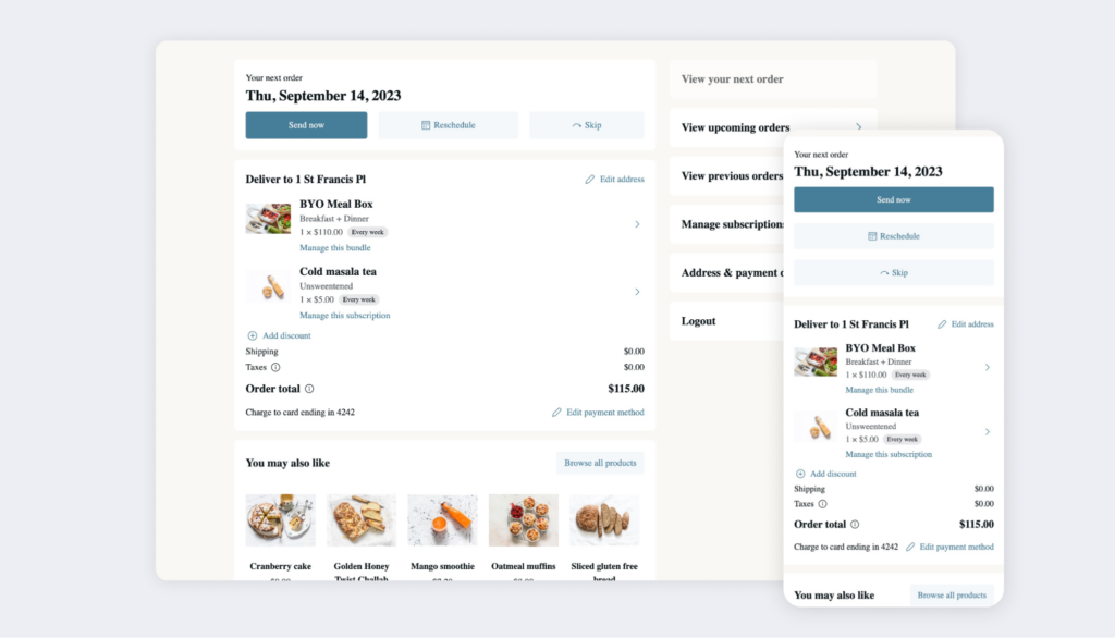
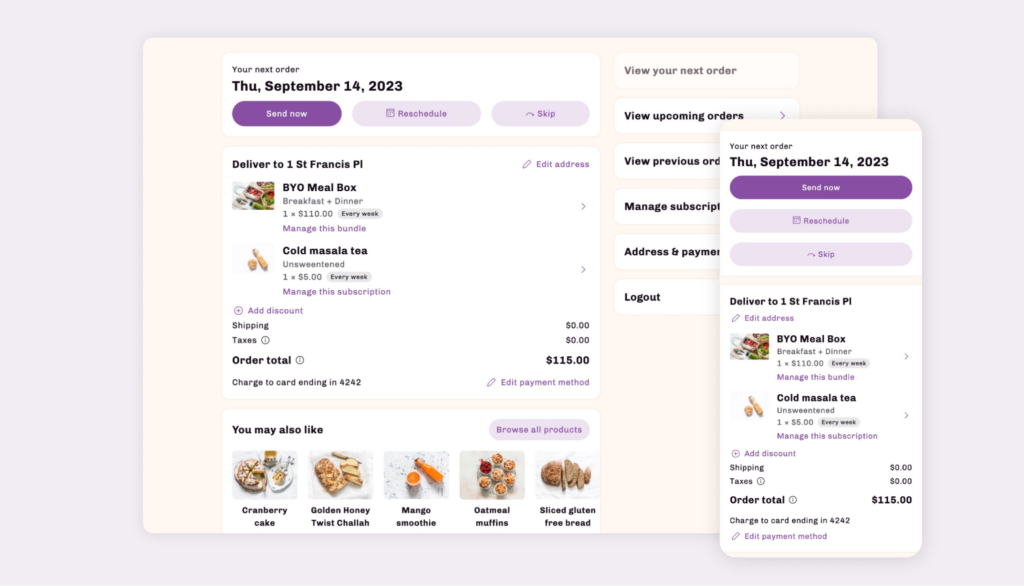
Looking for inspiration? Check out the customer portal makeover below, plus some examples of great customizations achieved by different brands using Affinity.
Before
After
Sources
[1] How to Identify Specific Color on an App or Website (Guiding Tech)
[2] Tint & Shade Generator (Market Tints and Shades)
[3] Colour Contrast Checker (Colour Contrast)
[4] Building trust & loyalty through a branded customer portal (Recharge)