If you are a Recharge merchant, you might have noticed a big difference recently. We just completed a major redesign of our merchant portal. Doesn’t the end product look great?
This is just the beginning! Over the next several months, Recharge will continue to focus on making it easier for merchants to manage their subscription business.
In honor of the launch, we thought it would be fun to sit down with our product designers, Kayla Sawtelle and Jessica Versaw, to hear about their design process and share some tips you can utilize to improve your user experience. Continue reading to learn more!
1. Define the problem
Problems can surface through many different channels—internal conversations, customer feedback, or market and competitive research. Here’s what we discovered during this step in our journey.
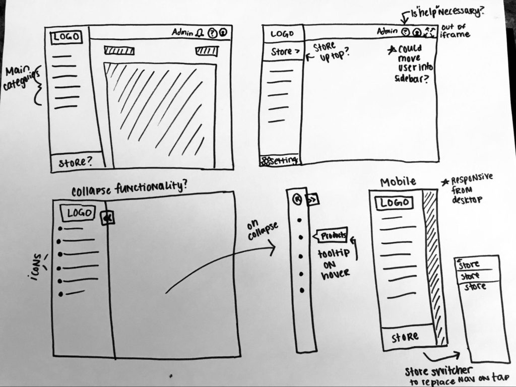
Sidebar navigation
Recharge has grown dramatically over the past few years. As we’ve grown, we’ve continued to make our product more and more complex—including new features and tools, acquisitions, and an updated permissions structure. Through customer feedback and internal conversations, we realized we had outgrown our existing architecture and needed to move forward with a reimagined design that could support our future development and our merchants in new ways. For example, our new navigation is accessible on all devices.
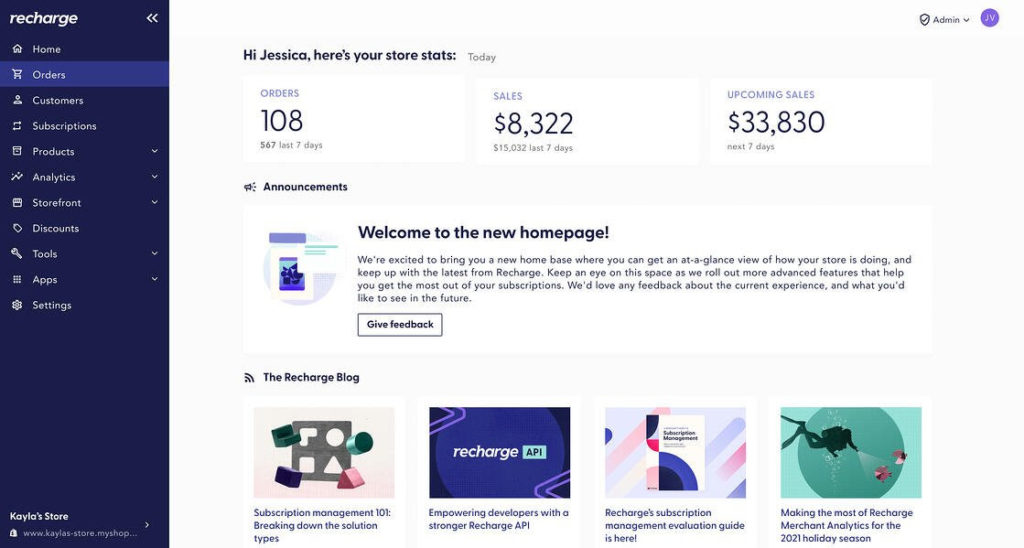
Homepage
This one was a bit different since Recharge didn’t have a homepage. Merchants were just directed to the ‘Orders’ page. The new homepage is our first step in creating a true home that will help merchants get a high-level view of their business and access important information about their subscriptions and our product.
Merchant tip: Write a succinct statement describing the problem that needs to be solved. Questions you can ask to arrive at this statement are:
- Who is affected by the problem?
- What is the problem?
- Where does this problem occur?
- When does the problem occur?
- Why does the problem occur?
- Why is the problem important?
2. Brainstorm ideas & develop different concepts
We always go wild and think big by starting with a lot of notes and sketches. At this step, our designers avoid jumping straight to concrete designs. We spend time researching and capturing best practices from other apps and user experiences that we admire.
Sidebar navigation
There were many items to organize into a sidebar and multiple ways to do this. Should we keep the navigation at the top of the portal? Where should the store switcher live? Should the navigation be collapsible? How should it function on mobile? How should we display administrator info?
We looked at best practices inside and outside of the ecommerce space. Our designers started with pen and paper concepts and then moved to wireframes, which are a useful tool for looping stakeholders into early conversations and receiving valuable feedback without getting too wrapped up in small details.
Homepage
Since we didn’t have anything to work from yet, our designers started their research externally. They looked at various homepages and analytics pages. What kind of layouts were common and intuitive to the user? What information seemed useful? Similar to the navigation bar, they started with sketches around the main ideas and flow of the page, without worrying about fonts or colors. All sketches are interspersed with notes, questions, and assumptions to test out.
Merchant tip: When beginning a new project, it’s helpful to brainstorm without having to make something look nice. Have an idea? Grab a piece of paper and a pencil and get started.
3. Obtain feedback
Feedback is extremely critical to the design process. Before beginning outreach, our designers gathered a list of guiding questions to use during this step. They also interviewed both internal team members and external users (customers).
Sidebar navigation
For the navigation feedback, our designers conducted a card sorting exercise. They gave a list of navigation items to participants and told them to sort the items into categories, then name them.
Homepage
The designers worked with various internal team members to define different assumptions they had about customers’ needs and tested those assumptions during interviews.
Common methods of getting feedback
Short surveys: Create short surveys with a mix of questions (short answer, ranking, long answer, or open-ended) and send them to internal and external users. Always have someone take the survey before sharing it more widely to ensure it makes sense.
User interviews: Set up feedback conversations. This can be done 1:1 or in a panel format.
User testing: There are sites like usertesting.com where you can have users try out your designs. We haven’t used this website at Recharge, but we have observed merchants using our products and had them talk through what they like and dislike, which is even better because we know we’re getting feedback from our specific audience.
Merchant Tip: Interview customers with specific questions. Take time to first clearly define what you’re trying to learn. While you don’t want to read from a script, you do want to reflect on what questions you want answered. Create a bank with questions that will help you learn or confirm your assumptions. Do dry runs of your questions with internal team members or people you trust.
Structure your feedback so that your assumptions or ideas about what’s “right” won’t sway your feedback in one direction or another. Your own bias can steer feedback if you’re not careful.
Design is an ongoing process
At Recharge, we continue to solicit feedback from our users after we’ve shipped the “final” product. We’re a startup and ship quickly, but always work to make improvements as we get feedback.
Merchant Tip: Keep ego out of the process and get collaborative! Ask others for feedback and ideas. Most importantly, avoid thinking that there’s one clear solution, because the right solution is always whatever best solves the user’s needs. Lastly, be willing to pivot and make changes as you go.