If your ecommerce brand sells subscriptions, you’re already familiar with the incredible power of these offerings, from a reliable recurring revenue stream to stronger, longer-lasting customer relationships. But to get the most out of your subscriptions, it’s worth creating a thoughtful and intentional subscription landing page for your brand.
What is a subscription landing page, exactly?
As opposed to your other ecommerce landing pages, your subscription landing page is centered solely around your recurring products or services. And though these pages are often used to generate leads, they’re also a valuable tool for setting customer expectations.
This is where you’ll clearly and succinctly explain how your subscriptions work, highlight their unique value, and dispel any misconceptions around subscriptions. Your goal? To not only attract new subscribers to your business, but also to attract loyal customers that will increase lifetime value for your brand. And your method? Showcasing exactly what separates your subscription offerings from your one-time products, as well as what sets them apart from your competitors’ offerings.
Whether you’re a subscription box company or a digital membership service, we’re here to guide you through how to write your own landing pages for subscription success.
Tactics to use for the best subscription landing pages
To create a high-converting landing page that attracts new subscribers, it’s important to be as clear and engaging as possible. By centering the customer experience in your copy, design, and imagery, you’ll help your target audience understand the “why” of your subscriptions, encouraging them to sign up.
Now, let’s break down some actionable steps your brand can take to build that clarity and engagement into your entire page—from your copy to your photography and everything in between.
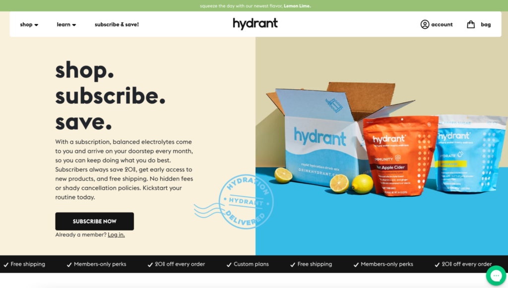
Showcase your value proposition
The unique selling proposition of your subscriptions is one of the most important things you can highlight on your landing page. Potential subscribers want to know what you’re offering and why they should purchase it—and they don’t want to have to wade through your copy to find that information.
You can—and should—weave the “why” behind your subscriptions into your landing page in a variety of ways. Many successful brands start with a succinct, snappy, action-driven header that demonstrates the value of their subscriptions. From there, they’ll often include a short paragraph explaining exactly what customers get when they sign up for recurring orders, as well as any key benefits.
It’s also important to keep in mind that some of your potential customers may have never signed up for a service like yours before. While most people are familiar with newspaper or magazine subscriptions and streaming services, some shoppers haven’t experienced a subscription box service or “subscribe-and-save” product.
In as little space as possible, build in language—like “delivered straight to your door”—that makes the benefits of your offering as clear as possible in your long-form landing page. By explaining this succinctly, you’ll demonstrate the incredible convenience that your subscriptions can bring.
When it comes to the value of your subscriptions, time is of the essence. You only have a moment of a site visitor’s time to give them a clear reason to subscribe—so make the most of it. Be clear, be succinct, and give customers a compelling reason to sign up as soon as they visit your page.
Outline the timeline & benefits for your subscriptions
Because a subscription is a long-term agreement with your customers, it’s essential to be clear and upfront about the timeline and benefits of your offering on your landing page. And, because every subscription offering is different, this is important not only for potential customers who are unfamiliar with subscriptions in general, but also for any customer looking to sign up for your recurring products and services.
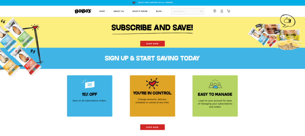
Do your customers have different options for the cadence of their deliveries (for example, weekly, monthly, or bi-monthly subscriptions)? Do they receive a specific discount? Do they have options to swap different flavors of products, and/or a deadline by which any changes can be made to their order?
In both your copy and your design, find ways to communicate this valuable information so your customers fully understand what they’re signing up for. This includes your headers, any designed icons, and short descriptions. This form of expectation-setting helps ensure that the right people sign up for your service—ones that will stay with your brand over time.
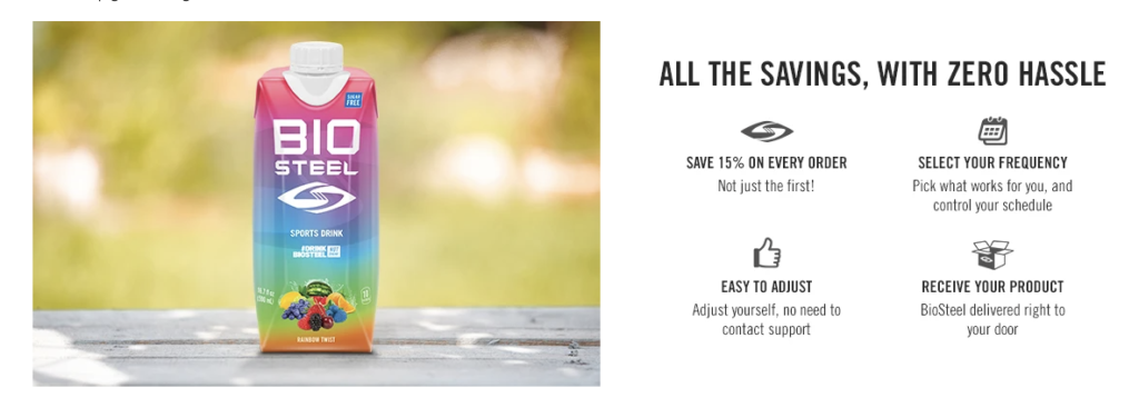
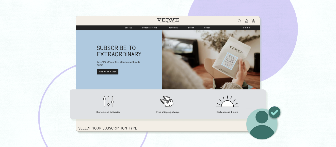
Showcase eye-catching product photography
Product photography is another crucial aspect of high-converting landing pages. After all, subscriptions are a commitment, and this type of imagery helps potential subscribers visualize exactly what they’ll get if they sign up for your products or services.
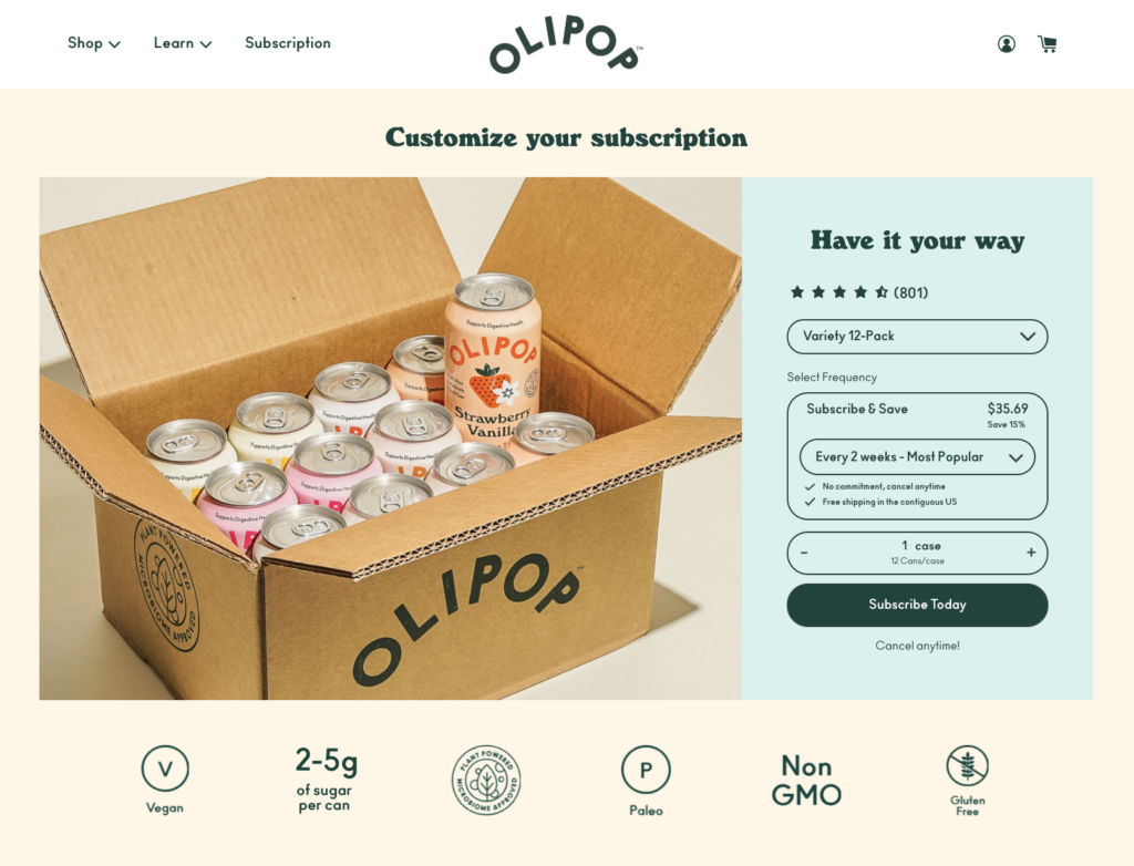
Of course, it’s always important to ensure that your product photography is on-brand, visually compelling, and exciting. But, as with all other elements of your page, it’s important to be clear here and not verge too far into the abstract. For example, in their hero image, a curated subscription box company may find it useful to show potential customers the full contents of a box to be clear about exactly what the customer will receive when it shows up at their door.
Pairing your product photography with succinct CTAs (we’ll get to those next) or a signup form is also a powerful strategy for lead generation conversion rates. By placing the two elements in close proximity to each other, you’ll make it easy for shoppers to sign up for your service, and they won’t have to comb through your whole page to do so.
Include a compelling call-to-action
Fine-tuning your call to action (CTA) is key for all lead-generation landing pages, and your subscription landing page is no different. You’ll want to provide clear CTA buttons in multiple areas of your page, making it convenient for shoppers to click and subscribe.
Because the character limit for CTAs is so limited, it’s important to choose your words wisely. Use action-driven verbs whenever possible to usher shoppers toward signup, and make sure any buttons are visually compelling from a design perspective.
Provide social proof
When people are uncertain about making a decision, they often look to their peers for guidance. That’s the logic behind social proof: By including testimonials or positive reviews on your landing page, you can help instill trust in your target audience.
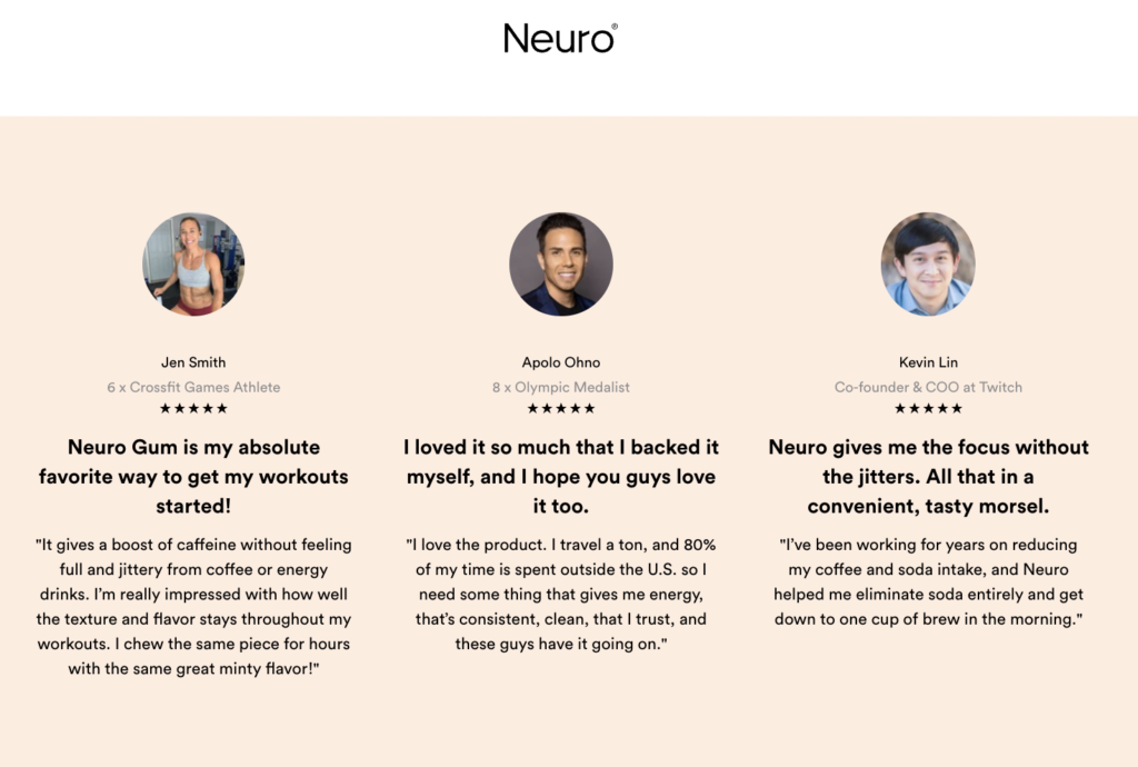
Whether it’s in short reviews, video testimonials, an average star rating for a product, or something else, some form of social proof can be helpful to include on your subscription landing page. Brands whose products are more complex or unique may especially benefit from this, as customers are likely to be less familiar with those products.
Bonus round: Add frequently asked questions
Depending on the products or services that you offer, your potential customers may benefit from an FAQ section on your site. This is another opportunity to anticipate your customers’ needs and any potential pain points or areas of confusion that might be preventing them from signing up.
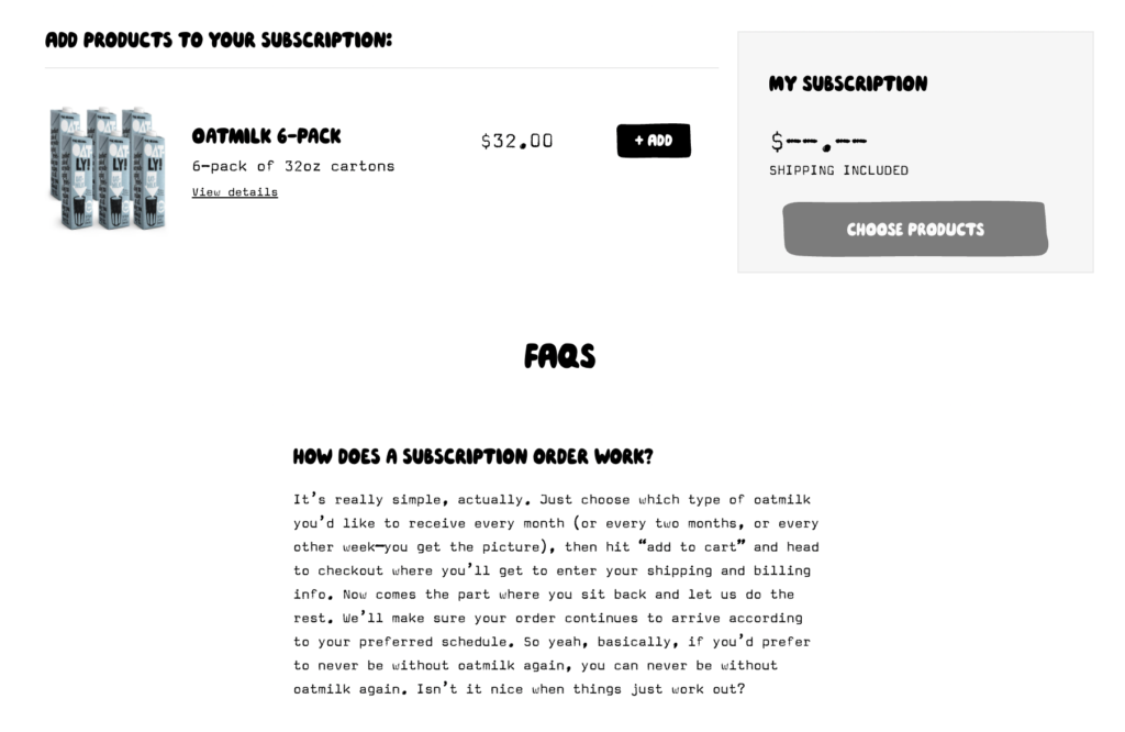
This is another valuable space for explaining your value proposition. You can also use an FAQ section to explain how your subscriptions work, why customers might choose your subscriptions over your one-time products (for example, any discount information), and any other areas that might need clarification. Again, this all ties back to your specific customers and what they need.
The bottom line: High-converting subscription pages center the customer experience
No matter your vertical or the types of subscriptions you offer, your subscription landing page should center your customers. By making your page clear, succinct, engaging, and scannable, you can give your audience a clear view of the value of your subscriptions. And by properly setting their expectations, addressing any of their concerns, and providing them with reasons to trust your brand and products, you’ll arm them with everything they need to make a decision about your subscriptions.